Day 15. Slide Ranch Goldbaum
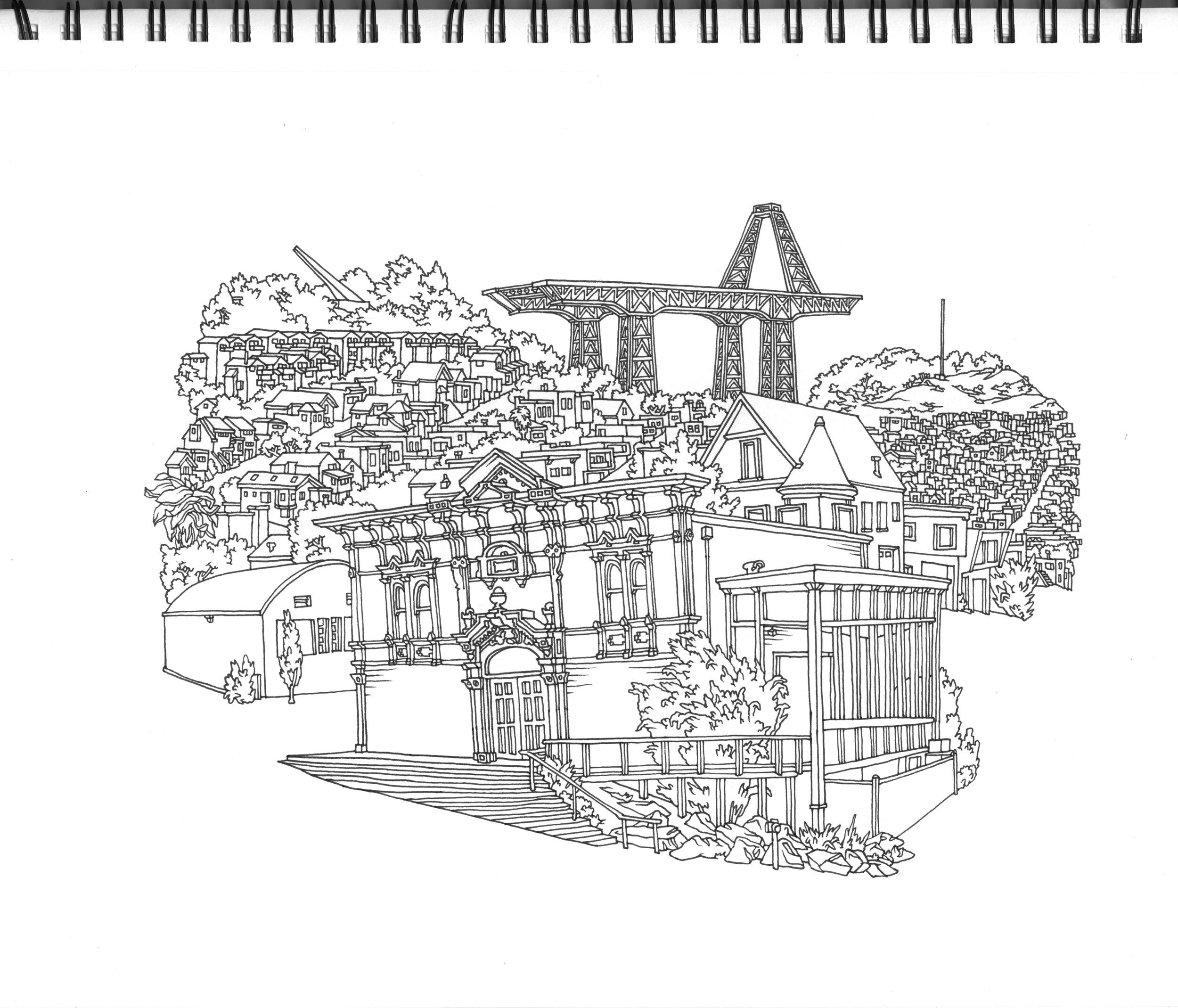
There’s this incredible San Francisco artist named Amos Goldbaum, who does these wonderful line illustrations of different neighborhoods in the city. He’s done a few murals, including one on the side of Pinhole Coffee, and I love his style. In addition to using a really consistent line weight, he maintains this very even spacing and curve, and I think it is really beautiful. Here’s one of his neighborhood drawings:

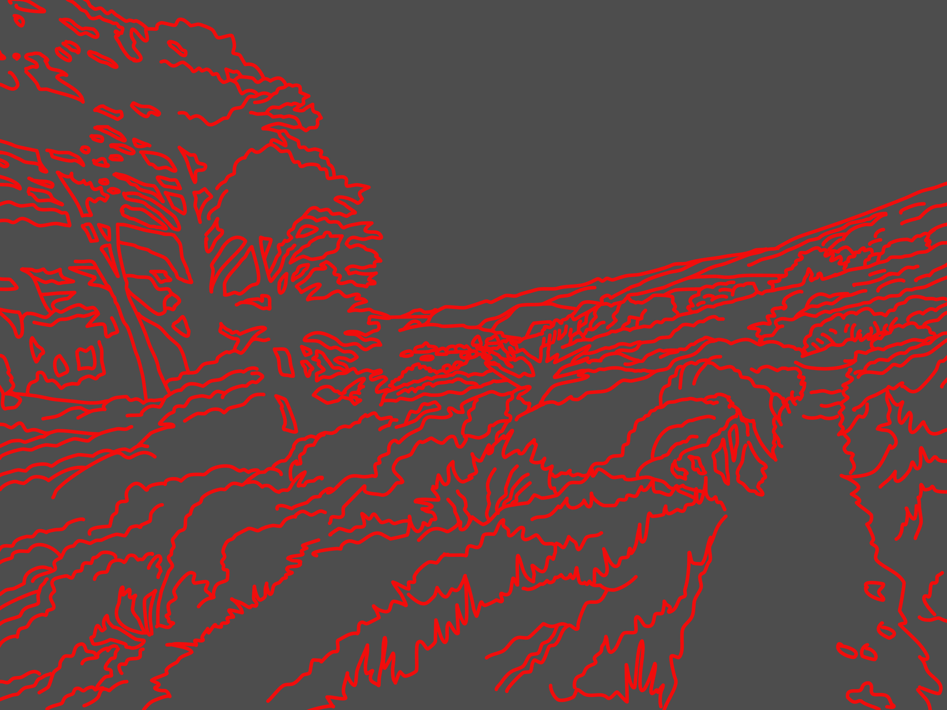
I decided to try to (respectfully, and admiringly) mimic his style, just as a way of learning more about Affinity Designer, and getting practice.

I learned that you have to love and attend to every stroke, which has a meditative rock-garden feel to it. Because I’m using a vector-based tool, I was able to go back and modify the strokes after I made them, and I found that I spent at least twice as long doing the cleanup and modifications as I did the original strokes.
I don’t think this was super successful, and I’m frustrated that I can’t figure out how to change stroke color in Affinity Designer after the fact. I feel clumsy with a lot of these things.
I’m also discovering that when I’ve got a few of these works posted that I do feel are a bit more successful, it makes posting the less successful ones more difficult.